I love overlays in a web application. That’s because most of the applications that I develop in the financial industry have so much data present on the screen. Some designers try to incorporate meaningful white space into the screens. However, inexperienced product managers want so much data on each page that real estate becomes scarce. In those instances, overlays can give you another UI layer to present information without having to rework mock designs.
What do we mean by UI Overlays
According to the Oxford Dictionary, an overlay is “something laid as a covering over something else.” In our technology area, the overlays are prominent pieces of content displayed over the regular user interface. They can be dialogs, non-intrusive windows, or animations.
What are the different Overlays and how to use them
Modal dialogs
We covered these types of overlays in our last post so I am not going to talk much about it. In short, they are small rectangular windows on your main view that removes the user from the web app’s content flow and requires interaction. They can’t easily be dismissed.
Dialogs
Dialogs are an overlay on a screen in which the user is prompted to provide information or select commands. Unlike modals, they are easily dismissed by clicking outside the container or using the escape key. Examples of dialogs are the image and document previews in Google Drive.
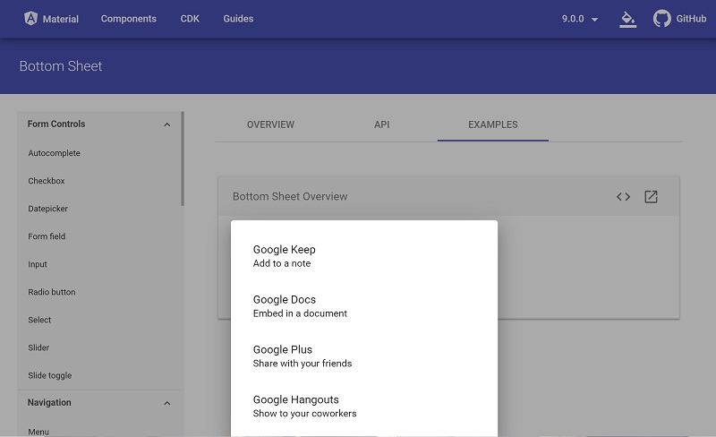
Slide-in Panels
These types of overlays are similar to dialogs except that they slide into view either from below or the right-hand side of the screen. Whereas dialogs typically render in the middle of the viewport. The slide-in panels’ primary use is to add more contextual functionality for selected content on-screen. For example, if you select a row in a table that represents a mutual fund, a slide-in panel could indicate all of the securities in that fund. They have the benefit of closing automatically if you mouse click outside their main area or press the ESC key. Be careful about confirming updates if the user closes the panel by accident.
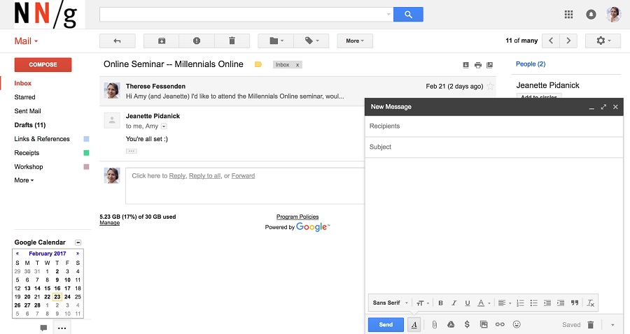
Nonmodal windows
A window that sits somewhere off-center screen is good for extra workspace. Unlike dialogs, they don’t attract focus by darkening the background. In the desktop version of Gmail, when you compose a new email, the edit window shows in the bottom-right corner of the screen. This allows you to not only type your email but also continue monitoring your Gmail inbox. That’s a great design choice to go with an overlay for a cluttered UI.
Tooltips
A tooltip provides a short description of a UI element. They normally only contain short amounts of helpful text. They usually appear either above or below the element. Care should be taken to test with multiple viewport sizes to make sure the tooltip is visible regardless. A tooltip component should have a flexible and adaptive positioning system, so development can be much trickier than initially believed.
The tooltip can be triggered either by hovering with the mouse over the element or initiating focus using the keyboard. A best practice is to not add tooltips to input elements as this can conflict with keyboard navigation and entry events. Instead, apply them to help icons.
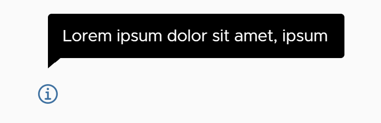
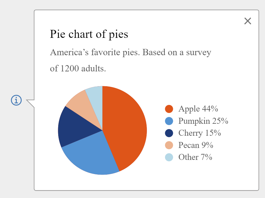
Signposts
A signpost displays contextual help or information in a popover dialog. Like a tooltip, it has an arrow/pointer that extends out to the trigger element, but the dialog is larger to fit more content. Signposts are designed to show a relatively small amount of content which may include: a title, images, text links or image links.
Signposts should be used when you want to show a small amount of contextual help of information without taking the user out of the current context. Definitely more space than a tooltip. Use sparingly as a supplemental element and not as a primary method of adding detail.
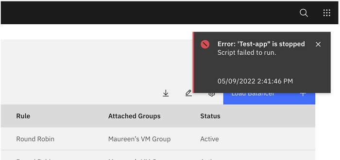
Toast Notifications
Toast notifications are just the overlay variant of the 3 most common types of notifications in a web application. They appear on the screen to provide some important message and then disappear after about 5 seconds. There are variations of this like Google Material’s Snackbar, but it is the same type of notification just placed at the very bottom.
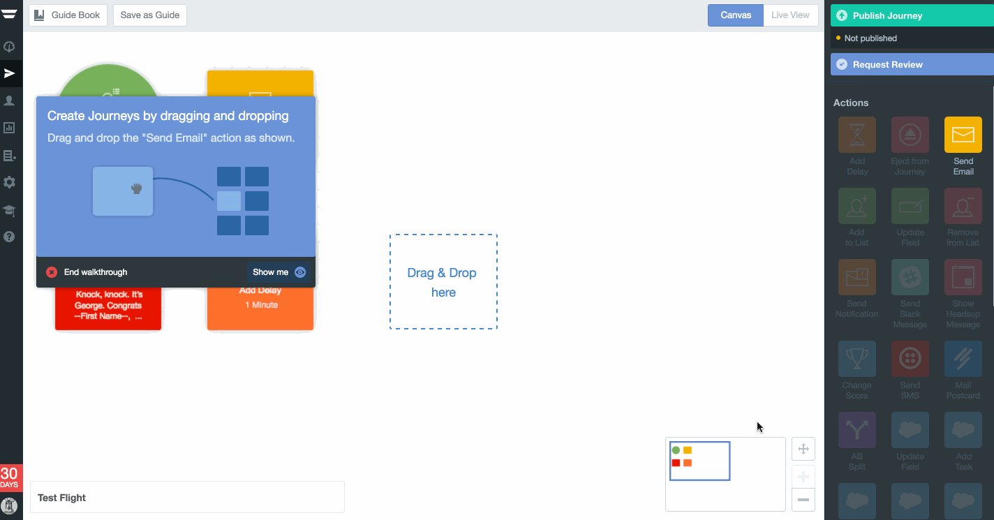
Animations
The only place where I have seen animations used to great effect is in web app interactive walkthroughs or product tours. The animations play on top of the main UI layer to give helpful training to the end-user on how to utilize the web product. Admittedly, not too many web applications have this type of navigation as it is expensive and time-consuming to produce and implement. But those web projects that do use animation are viewed with a high degree of admiration and respect by product users. This is mainly due to the perceived view of polish, technical prowess, and devotion by the product team for the user’s experience.
In closing, use the extra layer wisely
As I said in the beginning, overlays are great for extra space in your web application’s user interface. If the product team has determined based on metrics and user research that mass amounts of on-screen are necessary (like Gmail), then overlays are the only way to present additional content and functionality. However, be aware that the end-user may get lost if the interaction flows are not properly designed. The last thing anybody wants is excessive popovers on the screen distracting the user.

