Putting together a UI library with a set of components that resemble LEGO blocks is the main goal in many of my web projects. And just like my article about style guides, having a consistent set of pieces available will speed development and give confidence that feature extensions will conform to an overall design system. It is important for those pieces to go well together. Here’s my list of common components you should incorporate into your UI library.
First, let’s start with simple components, which consist mainly of HTML elements and CSS styles.
- Checkbox – A stylized input element that allows for multiple selections of options in a form fieldset.
- Radio – A stylized input element used when a list of two or more options are mutually exclusive, meaning the user must select only one option.
- Slider – A visual indicator for adjustable content where the user can move the handle on a horizontal track to increase or decrease the value.
- Toggle – A button that is used to quickly switch between two possible states.
- Search – An input element that enables users to specify a word or phrase to find relevant pieces of content without the use of navigation.
- Accordion – A widget that allows for generic content to collapse or expand along a vertical section on a page.
Next, complex components are made up of simple components and are more complicated to build.
- Tabs – Used to break out generic content along a horizontal section of the web page.
- Cards – Presentational widget used to provide snapshots and summaries of content.
- Dropdown – A list of options that can be used to filter or sort existing content.
- Combobox – Similar to dropdowns except that they provide an input field for users to search items and (optionally) add their own.
- Modal – A dialog overlay that forces the user to interact with it before giving them full access to the web page.
- Tooltip – Additional information text overlay provided upon mouse or keyboard focus.
- Pagination – A widget used to split up content or data into several pages.
- Table – A classic table allowing the presentation of low amounts of static data.
- Datagrid – Helps organize large volumes of data that users can scan, compare, and performs actions upon in a tabular format.
- Date Picker – Widget that allows users to select a single or a range of dates and times.
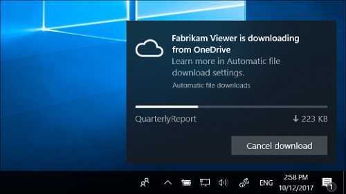
- Notification – Communication widgets to display important messages to end-user on actions, errors, time-based, or urgent information.
And there you have it, another list of an extremely useful set of pieces that your UI library should have in order to be valuable for a web project. With these core components, all the pieces will allow your team to move fast in implementing new useful features with a consistent style and high-quality. It’s a lot of work, but it will yield huge savings and rewards for your web application project.


