I am an avid video game player. Since my early teens, I have thoroughly enjoyed playing games with great mechanics, superb animation, and smooth increases in difficulty. Interestingly enough, the one visual aspect of all these video games that I rarely notice is the user interface (UI). It disappears. You don’t see great UI. And just like great UI guides you to have fun and spend a few hours of leisure, so too should a web application’ s UI be an entryway to well-crafted user experience (UX).
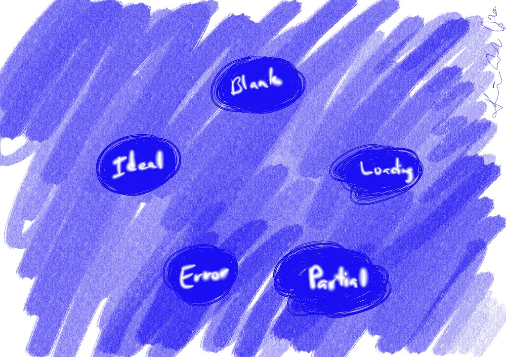
The main goal of the UI is to inform the user. The way the application presents this information forms the basis for the interaction experience. Based on my work experience, there are five states every screen should have to keep the user engaged and interested in what’s happening in the application. Those states are the following: Blank, Loading, Partial, Error, and Ideal. Let’s go over them at a high-level.
The Blank state is when the screen has no information to present. It is the empty state for most of your web components, where nothing is displayed. The clean condition is due to no selections made by the user, or it is the first time the user has interacted with your application. The Blank state is the perfect opportunity for you to make a first impression and to guide the user to the ideal experience. I will write more about this in a future article.
The Loading state is where something is happening in the application. Either data is retrieved from a server, or an action is being processed. In these cases, the user is informed asynchronous activities are taking place through spinners or progress bars.
The Partial state is where there’s incomplete information shown on a screen. Perhaps there’s only one user in your application where the vision was to have hundreds. In this instance, some features will not be activated (pagination or scrolling animations, for example). Here is another opportunity, just like in the Blank state, to invite the end-user to interact and continue using the web application.
The Error state shows that something wrong happened in the application. It is here that we need to give the end-user a chance to recover. Either retry the operation or retrieve a previously saved screen data instance. But for the love of everything holy, don’t make them feel stupid!
Lastly, the Ideal state is where all the pages have all the data and features components activated. It is here where all the example UI mocks the designers put together really come to life. Every high-fidelity prototype and marketing material shows this particular state.


