I am highly sensitive to bad user interface design. It’s a given due to my specialization in front end development. It justifies the improvements I do to help other people.

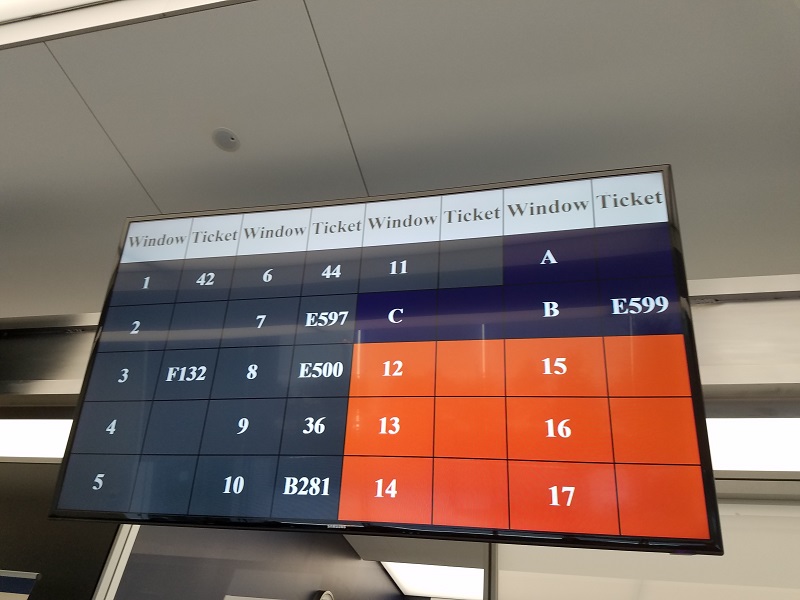
One day in late 2018, I paid a visit to the Social Security Administration office in Chicago. Automated machines generated a number for me and asked me to wait. Upon sitting down and looking around to see what number the office staff were currently seeing, I looked up and saw this monstrosity—
AAAAAAHHH!!
Nasty!
Let’s break down why this display is so awful.
First, the color palette makes no sense. You have a table with the header cells with a light grey background color. Then you have the window and ticket numbers intertwined on each row. Why not distinguish them with lighter alternating column colors? Also, the main content has background sections with 3 different colors; dark grey, navy blue, and orange. What do those colors mean? Where’s the legend? Super confusing.
The display information did not have dynamic animation or indicators showing the queue state. For example, one could not tell which window is currently occupied vs awaiting a person with a ticket number. All you see is the ticket number and nothing else. I often saw an empty window with an office worker empty while the display board showed a ticket number. Was the office clerk waiting for the person with the ticket number to arrive? Did the person just leave? Was the clerk on break? Grrr!
Lastly, not all of the windows in the office area were marked with a number. So I may see windows 1-11 marked but not A, B, and C. Huh! And what about windows 12-17? Does the orange background cell color mean they are not applicable? No idea! I did not take a picture of the rest of the room since it was full of people, but the layout on the board did not match the actual windows available on the floor plan. It was stupid.
The security guard that was in charge of monitoring the waiting area had numerous people go up to him asking questions about the board. In between his rote responses and Facebook newsfeed peeking, I asked him if it would be okay to take a picture. He stared at me for a brief moment then gave me the go-ahead. I hope that the office has upgraded its board since then. It hindered more than helped.
Have you seen similar issues with bad UI in your life outside the office? Share them with me. It’s fun pointing these things out.


