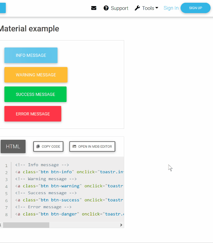
In my previous article, I brought up various notification types and how to present them on screen. Toast notifications can be easy to overuse in a web application UI. Sometimes we leverage them simply because they take up zero real-estate on our pages and components. No need to mess around with spacing and container resizing, as we do with inlined messages, if the notifications sit atop other content on the page. It is easier for a front end developer to just reach for toast notification component, incorporate it into the template, and get done with the feature.
The problem with overuse of toast notifications on a page is stacking. As the UI allows more and more toast messages to be created, each recent one is inserted at the bottom of the stack. This can create a column of messages that blocks and distracts from the content. See the animation below for an example.
A solution to the stacking problem is toast grouping. Many toast messages grouped together into a small, paginated single toast creates less clutter and makes it easier to see all content on a page. The only downside to this is that the toast now needs to persist on the screen until all the grouped toasts are dismissed. I think that is a fine tradeoff.
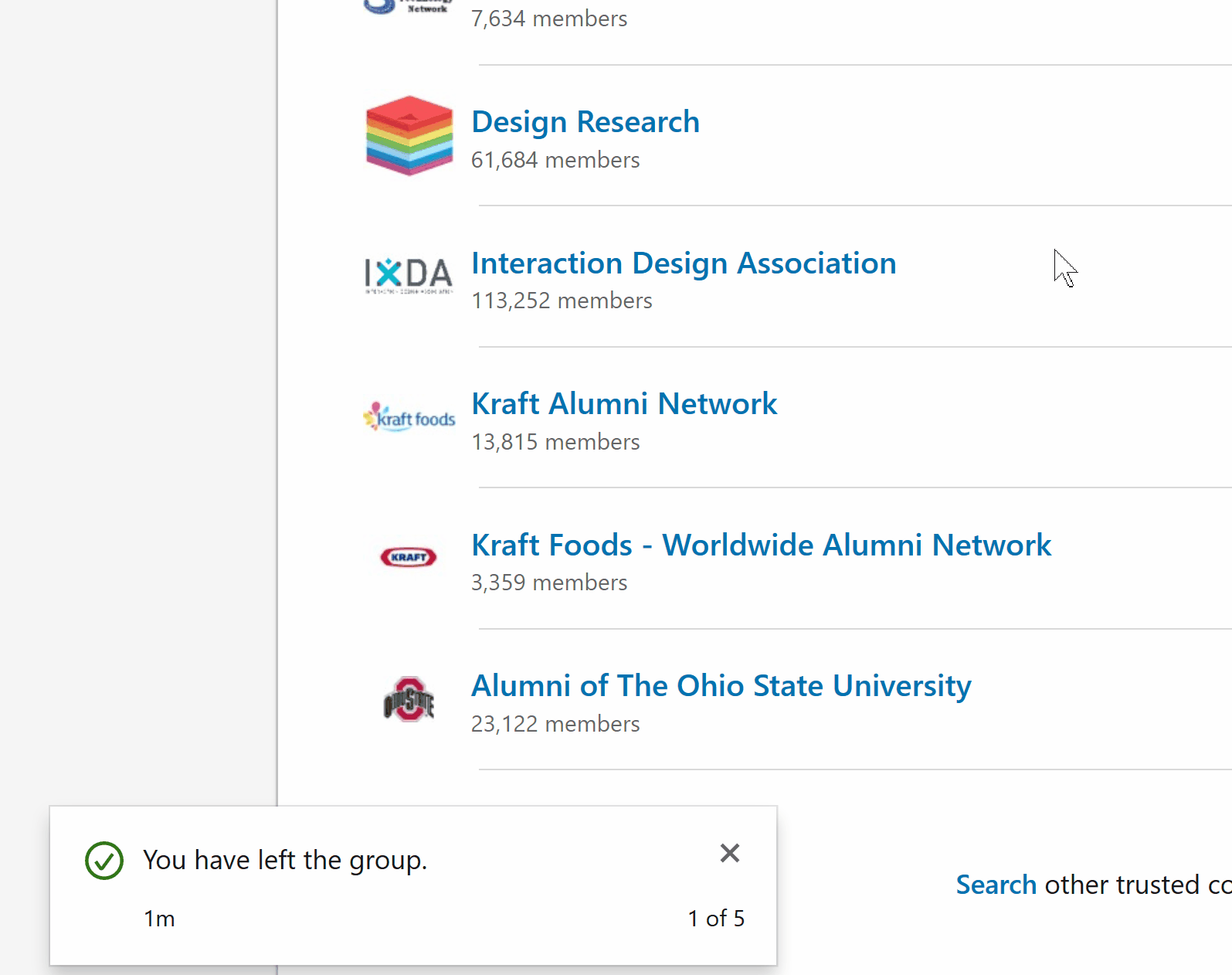
Credit: LinkedIn
As always, make sure to discuss toast notifications with the designers and product team early. Ask questions on where and how often toast messages are going to be used in your web application. The best long-term solution to having too many toast notifications is to redesign the content on the page. Eliminate the need to show too many toasts and use inlined messages instead. Unfortunately, we won’t always have that option so grouping is the next best thing.


