A modal dialog, with a twist
A product team once came to me requesting something that, on the surface, sounded quite simple. They wanted me to create a type of overlay that behaved similar to a modal dialog but with a twist. The modal dialog would need to allow the end-user to still have access to main navigation links on the web application. This would allow the end-user to navigate away from the landing page to another feature page without fulfilling the requirements on the dialog form. At the same time, the product team did not want the modal dialog to be dismissable until form selections were submitted. They wanted a modal that was “polite” in its interruption of the user’s flow through the application.
I moved forward and implemented the non-standard modal dialog for them. But all the work to get it to work was unnecessary and caused a lot of grief for my team. I learned from the experience that the modal dialog behavior should not be tampered with.
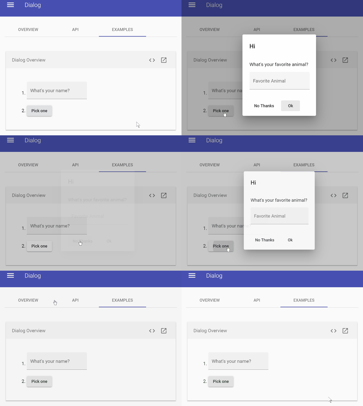
For UI purposes, a modal dialog should be a hard interruption to the user’s flow. It is not “polite.” The modal dialog also has the default ability to get dismissed either via an action button or a close icon. If no close button is available, then clicking outside the dialog container should automatically close it. The overlay color is darkened and made to cover the entire rendered page inside the browser to inform the user that no other elements on the page are clickable.
Problems that will arise by altering modal dialog behavior
Some common issues that will result from using a modal dialog component in a non-standard fashion are:
- Users will be confused by having a navigation menu available that allows for automatic closure.
- Confusion will arise when not having a close button or cancel button (as was my case) to dismiss the modal.
- The browser back button will need to correctly close out the modal dialog and navigate to the previous feature page.
- Trapping element focus within the modal dialog will be challenging to implement if you also want to enable keyboard navigation outside the dialog container.
- Implementing the logic to properly restore focus to the correct element on the page after closing a modal container will be challenging because of the ability to navigate.
- Browser compatibility issues.
These are just some of the issues that I ran into while implementing a non-standard modal dialog. Perhaps you feel that this information would help you handle the edge-case issues that such a UI request would generate. But frankly, it will just be added maintenance and convoluted code to address the problems that should not be present if modals are done correctly. Also, note that some users will interpret the alterations to the modal dialog behavior as bugs!
If you want to see an example of a failing non-standard modal dialog in the wild, go to Microsoft’s Office Fabric dialog component example page. On this page, the developers leave behind a nav header with a “scrollTo” mechanism to jump to the different document sections.
To recreate the failure, use either the Chrome v79 or Edge v80 browsers, and inside a screen width minimum of 1024 pixels, click on the Open Dialog button. With the modal dialog open, click on one of the navigation links provided. Then close the modal by either clicking on one of the action buttons or clicking outside the container. The result will be the loss of scrolling on the page.
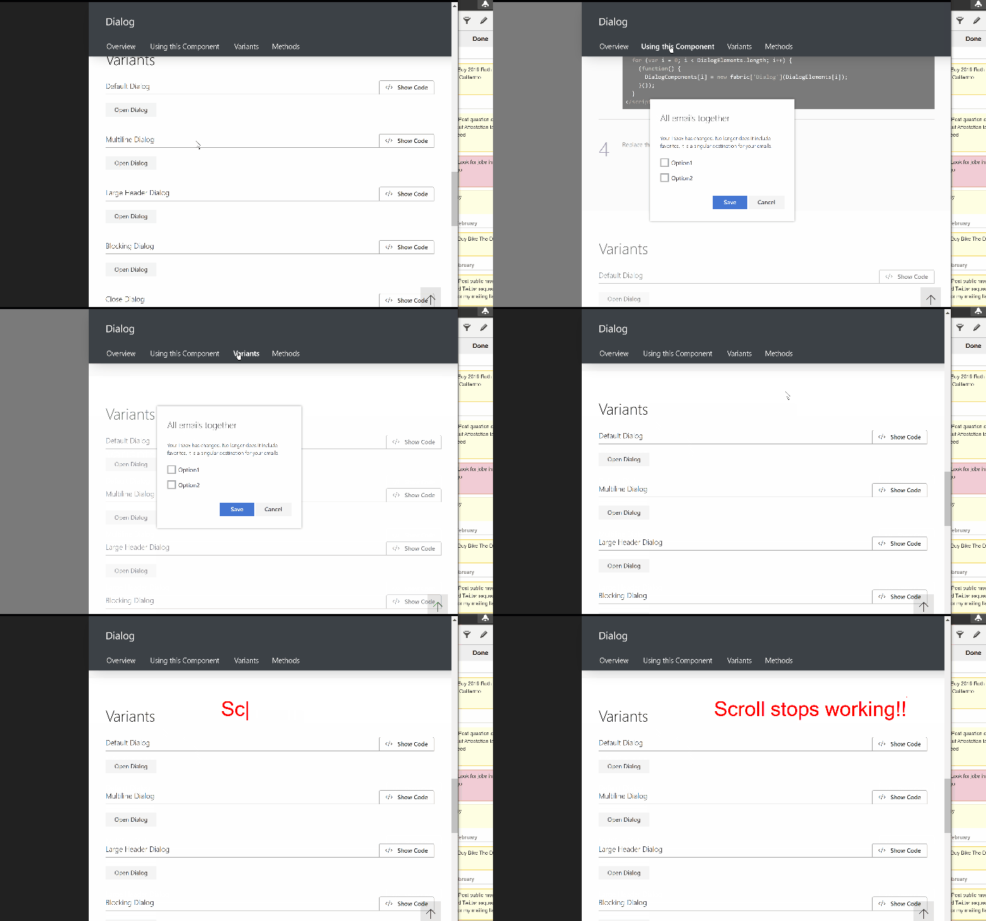
This issue does not happen on Firefox. An example of a browser compatibility issue caused by changing the modal dialog behavior.
Pushing back and suggesting alternatives
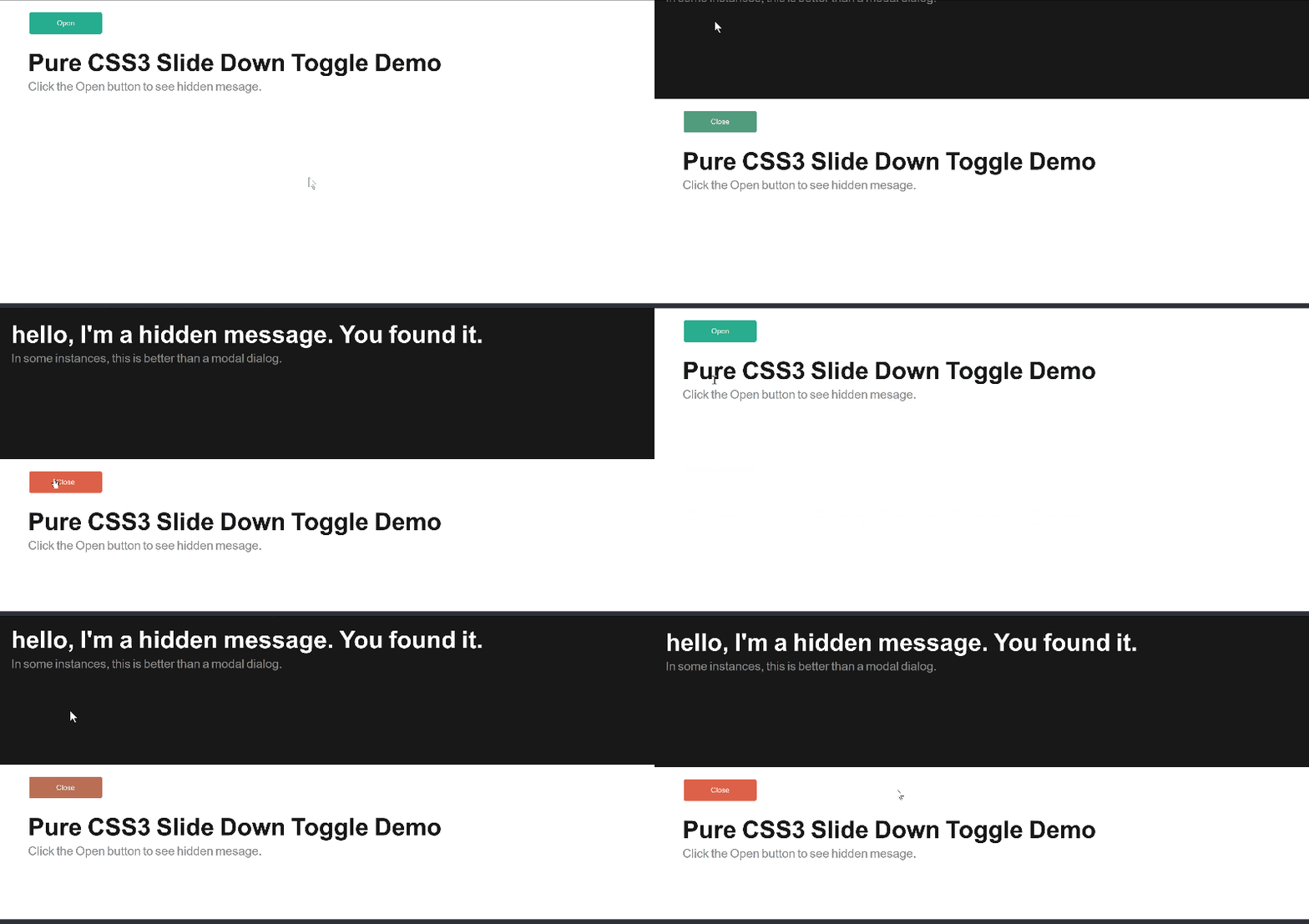
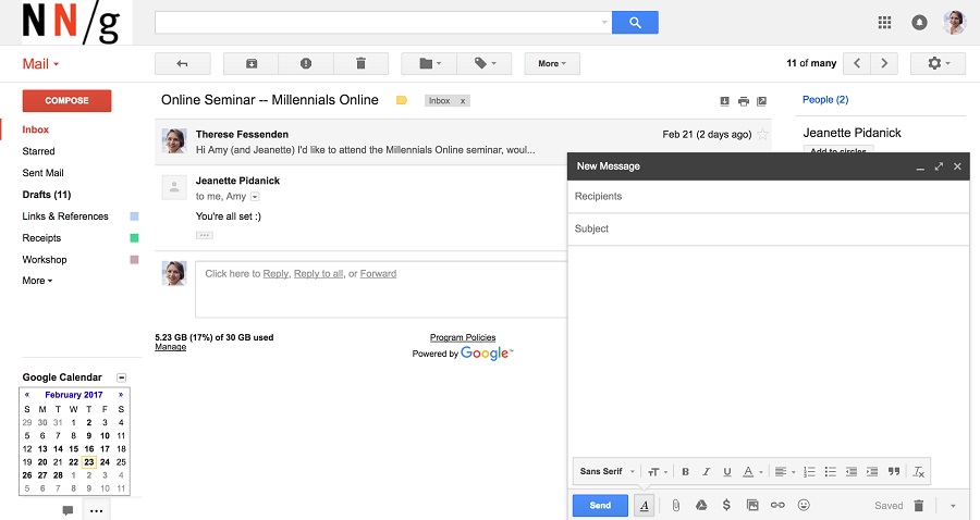
Whenever a request for a modified modal dialog comes to you from the product team, push back immediately. There’s no reason to break a well-known UI pattern. Instead, suggest alternatives like a sliding panel or nonmodal dialogs.
Closing – Don’t be wishy-washy with your interruptions
Sometimes it’s best not to mess with things that work. When the product team approached me about modifying the way that modal was going to be used in the application, they described a use case for the audience that made sense to me. They convinced me that perhaps, this one time, using an altered modal dialog was actually going to improve the user experience. Boy, was I wrong! If you are going to interrupt the flow of the user on a web application, be forceful about it. Don’t try to be accommodating with a UI pattern that is not meant to be.
